Car Wash Menu Redesign
UX / GRAPHIC DESIGN
Commissioned to do a redesign of a local car wash company's service menu. The aim was to simplify the menu so that the user can discern the difference between the packages that are on offer in order to smoothen the experience and increase sales.
Additionally created a logo for them to help modernise their business further as their old branding felt outdated.


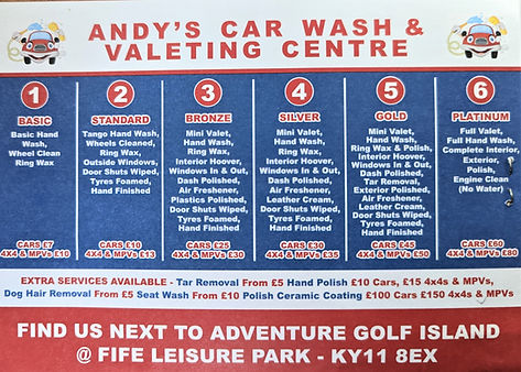
Original Design
Firstly, it was important to focus on the original menu design to establish its pain points and where it could be streamlined.
After speaking with the client, he mentioned that customers are often confused as to what they want from the board when they approach the car wash.
At first glance, it is a bit overwhelming. The 6 different options and the amount of text to read. However a lot of the text was repeated for each option so this was something to work with and we had discussed reducing the number of available options for his customers.
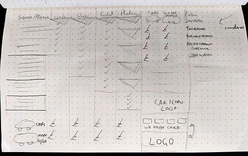
Initial Sketch
The initial step was to analyse all of the information that was required to feature on the menu into main services and extra services. Once established, I created a similar tier list from left to right but made it smaller and used ticks to confirm which services were included in which tier. Another distinction to be made was the price difference between cars and MPV's which was illustrated by icons.

New Design
The sketch was imported into Adobe Illustrator for reference. The extra services were added at the side of the tiered list and with the remaining space underneath, I included a new logo, social links as well as a section on accepting cash and card as this was mentioned in our original meeting. Most customers assumed that the car wash was cash only & changing that assumption would allow long-term growth in a card dominated society. By reducing the overwhelming wall of text and with the options clearly dissected, this iteration is a step forward in enhancing the customers experience.