
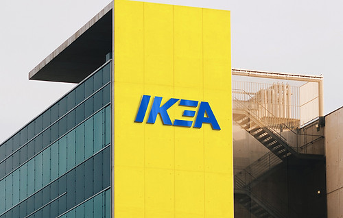
IKEA Logo Redesign
GRAPHIC DESIGN
I decided to try and redesign a famous and iconic logo that has huge recognisability in an attempt to push my graphic design skills within Adobe Illustrator. By redesigning such a famous logo, any adaptation to its current form invites scrutiny which I thought would be a good way to elevate my design skills to create a new alternative to the iconic logo.
History of the IKEA Logo
During the research phase it was clear that IKEA are innovative problem solvers. Founded by a young eager entrepreneur Ingvar Kamprad who was raised on a farm called Elmtaryd near the village of Agunnaryd. Being in a remote area of Sweden, fulfilling orders from a catalogue as was done initially was difficult as it was expensive to ship to the big cities as well as products being damaged in transit.
This is where the flat pack idea and self-assembly was born. Affordability is also a key component of IKEA's USP, the desire to reach many people with good furniture at affordable prices
Initial Ideas
I started out by focusing on things that were synonymous with IKEA. I considered the flat pack furniture element of their business and thought this was a good place to start. My initial concept I had considered regarded incorporating an interlocking element into the design to exemplify the pieces of the furniture coming together perfectly.
In addition to this, I was always conscious of the fact that IKEA at its core is a homeware store and wanted to incorporate an element of this in the logo redesign.

Early Progress

I moved into adobe illustrator and started vectorizing the doodles to see what would work and what wouldn't. I wanted to show the iterations to show the thought process when designing and to show where it started compared to where the project finished.

I wanted to show the iterative thought process when designing and to show the undertaking in all its stages. IKEA is a brand that we are all familiar with that has a specific colour palette, which I felt was to put it simply, untouchable. So I decided early on in the process that I should not alter the famous blue and yellow combo.


1
2
3
Using the interlocking concept mentioned previously, I created equal spacing between the letters and wanted to create a feel that the letters, if assembled would fit together effortlessly comparable to IKEA furniture
Perhaps, it could be argued, that this variation may be a bit too abstract or not as legible as the others but the house icon in the negative space adds something different and is reminiscent of the FedEx logo.
Similar in the interlocking style of the first option but with an alteration on the letter 'A' to add a house element to the design to illustrate that IKEA is your one-stop shop for all things homeware.

Colour Variations


Logo Patterns

