cricut: quality of life improvements
UX / UI DESIGN
A collection of 5 conceptual new features to reduce friction & pain points and increase the overall user experience and functionality in the Cricut Design Space desktop app. All features combined can be viewed in gif format at the bottom of the page.
1
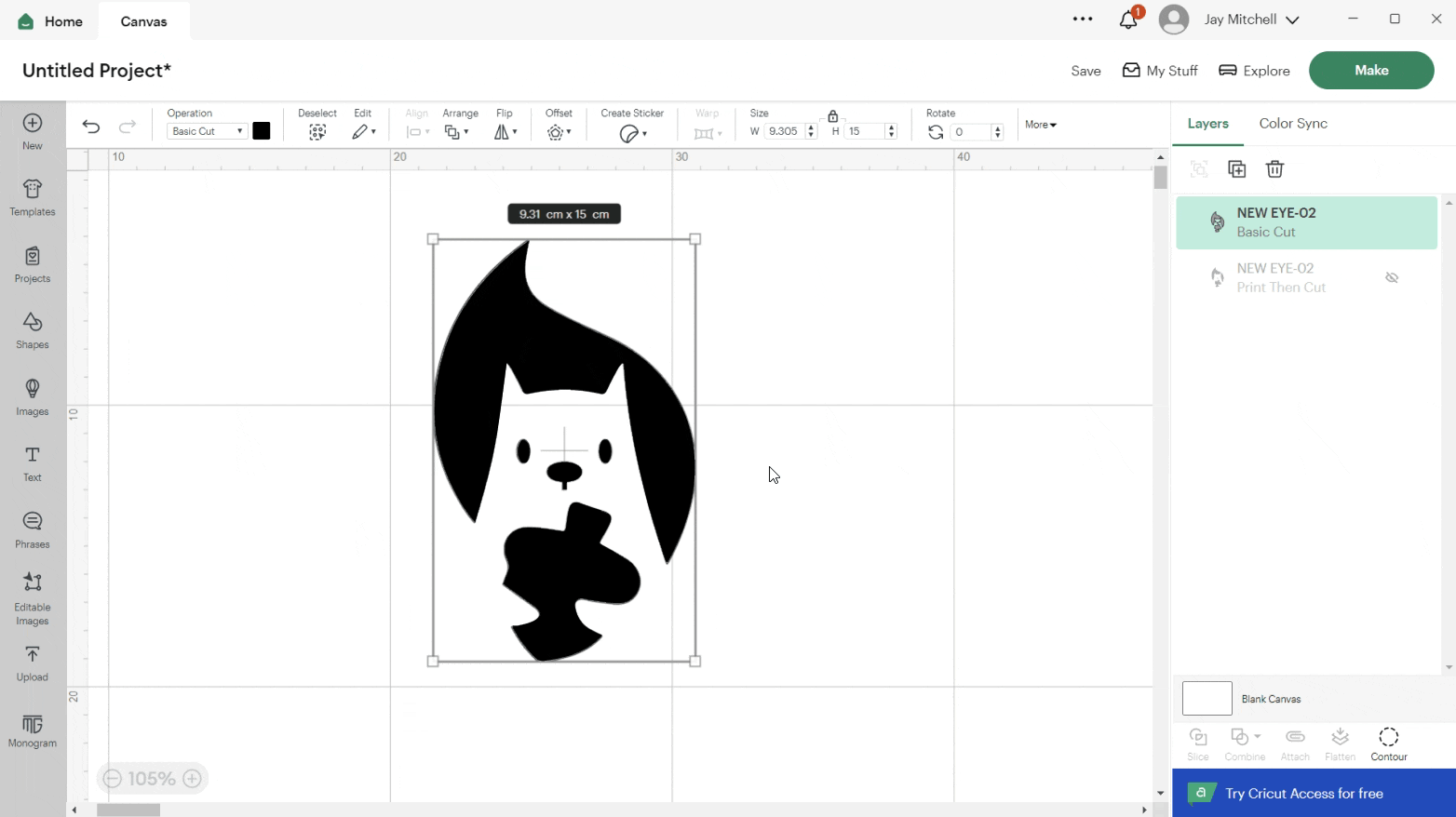
Allowing users to align their designs to the cut area (left, middle, right)
Problem: Having no option for users to align their designs so they are mathematically centres, left aligned. etc and only giving users the option to manually position the designs themselves.
Solution: By having an align option in the ‘prepare’ phase, this will help users who want to have their design specifically centred, for example, as opposed to having to ‘eyeball’ it. It can be fiddly to try and find the exact centre of the red marked cut area so having the align tool would make it mathematically accurate and save the users time when making by making this process more convenient and at the click of a button
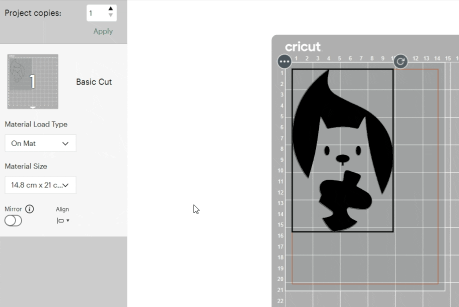
Allowing users to scale their designs to ‘Fit’ in the chosen cut area.
Problem: Choosing the wrong size in the ‘make’ phase and entering the ‘prepare’ stage and not being able to adjust it. Eg. Trying to remember how big a design has to be to fit fully on an A5 sheets cut area isn’t easy for new users especially if the design may fit better landscape than portrait depending on its dimensions.
2
Solution: having a ‘Fit’ option will automatically scale the design to be as large as it can be in the cut area selected. The subsequent scale feature would make that choice non destructive as users can still scale the design manually afterwards if required.
3
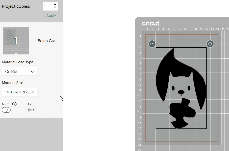
Allowing users to scale their designs in the ‘Prepare’ phase.
Problem: Users only have control of orientation and position and do not have control of the scale properties in the ‘prepare’ phase. This means that if they want to make adjustments they have to cancel the cut and return to ‘make’ phase and re-enter ‘prepare’
Solution: Having the option to scale their designs within the ‘Prepare’ phase allows the users to fine tune their designs as opposed to having to cancel and return to the ‘Make’ phase if they change their mind on the scale, for example the want a larger border around the design. When hovering on the corner of the design, a scale arrow will appear as well as the dimensions that it has been changed to. Dimensions will disappear when moving design to allow users to position their design without blocking any of the measurements on the background cutting mat so users can align to these measurements clearly if required.
4
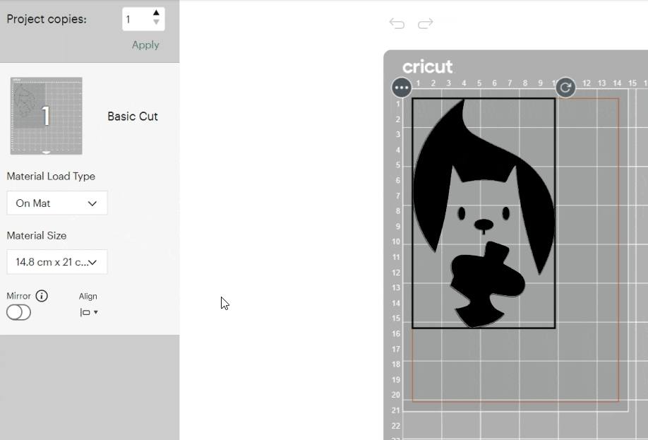
Allowing users to undo and redo in ‘Prepare’ phase.
Problem: Currently, you can alter a designs rotation and position in the cut area & accidentally rotating a design slightly or doing it purposefully without holding shift key and not getting the orientation perfectly angled (90 degrees, 180 degrees etc.) makes it difficult to return the design to being perfectly straight and requires users to ‘eyeball’ it.
Solution: Adding an undo and redo option will give users more control. Undo and redo feature would eliminate an issue like this and prevent users from cancelling the cut then making again to reset the orientation. (users can use back arrow or ctrl + Z [similar to other software packages])
5
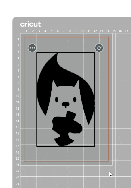
Providing enough contrast between basic cut colour selected and background colour in ‘Prepare’ phase.
Problem: When selecting a basic cut colour, the cut area in the prepare stage has the same background colour making it difficult for users to position their designs correctly. Using the same colour for the design and the cut area provides little to no contrast making it difficult for users with visual impairments.
Solution: When selecting a basic cut colour at the ‘make’ phase, the background colour in the cut area in the ‘prepare’ phase should be suitably contrasted to meet accessibility guidelines. By keeping the cut area one colour such as grey in this example, the selected colour will differ from the grey background offering a natural contrast. Perhaps limiting the colour options so that only contrasting colours can be selected could be an idea moving forward.
Combined features